

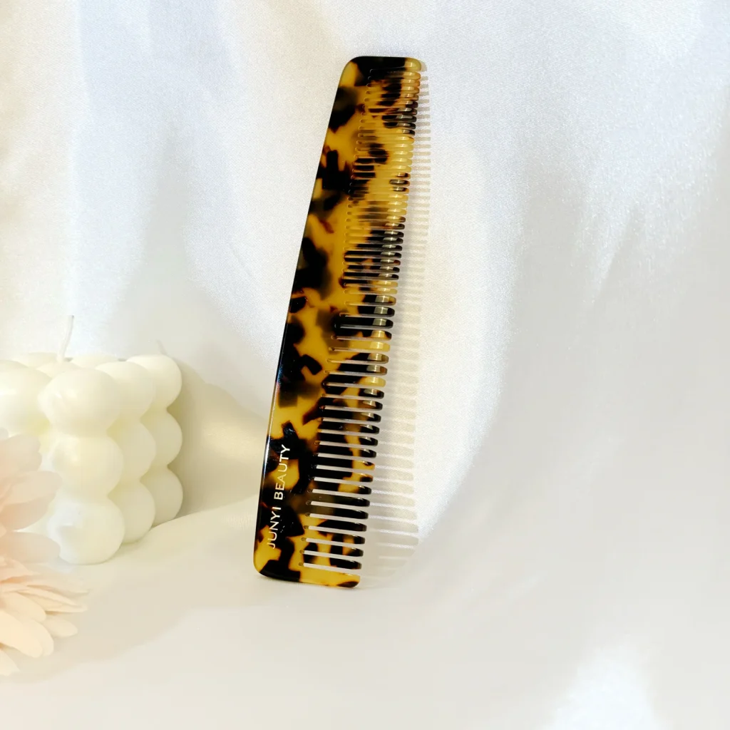
For tortoiseshell acetate color matching, check more than the shade of brown. Compare the balance of light and dark areas, the size of the markings, translucency and how the pattern looks on the finished part.
Here, “tortoiseshell” describes a visual pattern in cellulose acetate, not material from an animal shell. For a custom comb, eyewear component or accessory, the pattern needs to be judged at the scale and thickness of the actual product. A small flat swatch can point the discussion in the right direction, but it cannot settle every detail.
Turn “match this” into a more useful instruction
A reference image often mixes several things: color, lighting, gloss, background and product geometry. Before discussing a match, identify which of those things you want to preserve.
Is the priority an amber base, a dark overall appearance or a particular size of irregular patch? Should the lighter areas remain translucent? Must two parts appear coordinated when placed next to each other? Those are different requests.
If a physical reference is available, use it. If only a photograph is available, record its limitations and approve a physical sample before production. A screen image should not quietly become an exact color standard.
The color and pattern references can help name a direction. They are references for custom-product selection, not a catalogue of raw sheets or cut blanks sold separately.
Separate color from pattern structure
A material can be close in its overall tone and still feel wrong because the dark areas are too large. Another can have the right patch size but too little contrast.
Review these variables separately:
- Base tone: the color of the lighter or underlying areas.
- Dark-to-light balance: the visual proportion of the contrasting areas.
- Pattern scale: the size of the marks relative to the finished component.
- Translucency: how much light passes through the selected material and thickness.
- Orientation: any directional relationship required by the design.
A written description should accompany the sample, not replace it. “Warm amber base with smaller dark marks” helps explain why one sample is preferred. “Premium tortoise” does not.
An agreed color reference can help with parts of this discussion, but a single color code does not define an irregular pattern. Nor does it specify the appearance of layered edges.
Approve the pattern on the actual shape
A broad pattern can look detailed on a large reference and almost plain on a narrow component. Cutting a small shape from an irregular material changes which marks are visible. Shaping and polishing can also expose areas that were not prominent on the original face.
This is especially relevant to comb teeth, narrow eyewear parts and the ends of a hair accessory. A chosen pattern may need to be assessed across those features rather than on the largest flat area alone.
Use the custom tortoiseshell comb reference to discuss what is visible on the spine, the teeth and the edge. It is a product reference, not evidence that every possible pattern placement can be repeated exactly.
Where a pattern has strong direction, mark how it should run on the drawing. If the processor needs some flexibility in layout, agree which areas have priority rather than require an undefined match everywhere.
Use consistent viewing conditions
Compare samples side by side, under agreed lighting and against the same background. Look at the face, the edge and the part at a normal handling angle. For a translucent material, changing the background can change the apparent color significantly.
Photographs are useful for documenting the approval, but keep the physical reference too. Camera exposure, white balance and screen settings can alter the appearance. A photograph taken in one setting should not be used to reject another sample viewed in a different setting without checking the physical pieces.
For demanding color control, agree the measurement method and acceptance limits with the relevant parties. An irregular, translucent part can be harder to characterize than a uniform opaque surface. Do not adopt a generic numerical limit without defining what is measured and how.
Approve a range when the pattern is intentionally variable
A single sample can conceal the amount of variation you are accepting. If the order depends on a consistent overall look rather than identical marks, review representative pieces and document the range.
One practical approach is to keep approved examples showing the acceptable lighter and darker directions. Include examples of any variation that would be rejected, if available and appropriate. Agree the acceptable range with us before you approve production.
For coordinated pairs or sets, define the relationship. “Similar overall color balance” is different from “the same pattern in the same location.” The second may not be feasible with an irregular material. Resolve that before it is written into a purchase specification.
Keep the material and finish decisions connected
Gloss, matte treatment, edge polishing and final thickness all affect the appearance. A finish change after color approval can make the earlier sample less representative.
Ask whether the reference sample uses the proposed production material and finish. If an early sample is only a visual direction, label it as such and list the points that remain open. Do not allow a preliminary swatch to become a finished-product approval by default.
The color and pattern review should connect the design intent to a feasible material direction. Whether a requested effect can be achieved needs review; color selection does not imply that every new formulation or pattern can be produced on demand.
What to send with the request
Send the physical reference where available, photographs that explain the design, the product drawing or outline, the intended thickness, the visible faces, the finish and the quantity by color or design. Identify whether exact matching or an acceptable visual range is the goal.
We make custom acetate products and components. For a color sample review, send the drawing and material reference, and show the pattern balance you want. Check the sample at the finished size and thickness before approving the color and finish.
Technical reading: Mazzucchelli 1849: cellulose acetate formulation and color background. The approval method here is a project-review framework; it is not a guarantee of a color match or a claim that AcetateWorks uses the cited manufacturer’s materials.